Return to Moubal Sets page
MOUBAL - SET 0
There are many variations of this set. Some of the differences are subtle! Below what I found so far.
All have the same statistics:
- Box lid dimensions: 239 x 239 mm
- Parts: 111
- Weight: 1.27 kg
Over time, different manuals are included:
- with a colorful village on cover
- with craft paper Art Deco cover
- with a colorful gnome carrying round windows
- same, but carrying square windows
- with a simple red and black gnome carrying square windows, with instructions in old Dutch spelling
- same, but with instructions in new Dutch spelling
Often, there is also a colorful price list in the box.
SET 0 - SERIES 2
Looking for more & better pictures!
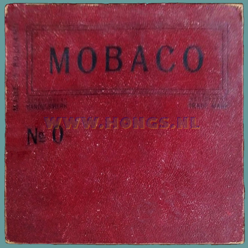
Lid
Photo courtesy HONGS
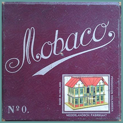
SET 0 - SERIES 3
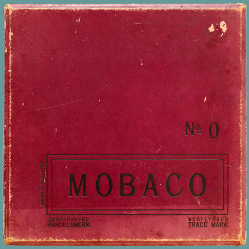

Lid Bottom. Price of fl. 2.45 was never an official price.


Inside lid. Note embossing of logo, and serial number 31074 Contents with round windows and numbered columns


This set comes with the colorful Set 0 village manual. Corner clips. Bottom box is taller than lid. Paper texture only visible when light is just right
It fits neatly in the box.
Set courtesy Leen Kalden
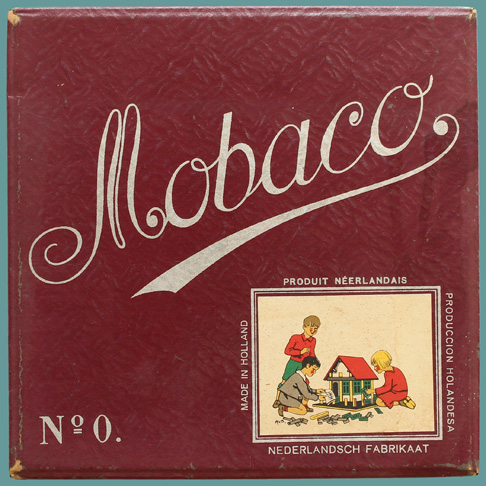
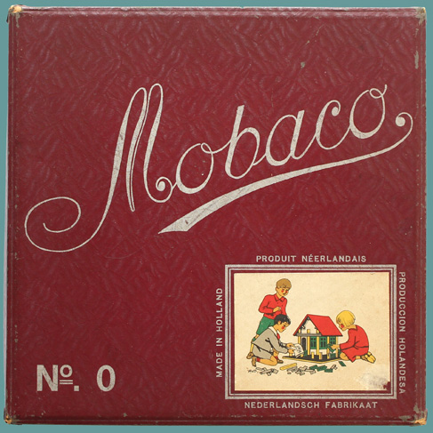
SET 0 - SERIES 4
Glued to the lid are the same images as appear on Price List Undated #7 which features 4 images (see below).
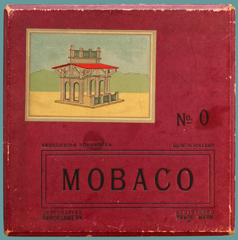
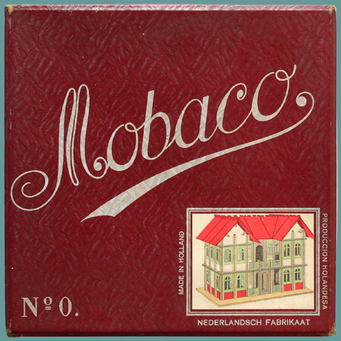
There are two versions of the text around the logo:
- Made in Holland to the left side of the double border, same as in Series 3
- Made in Holland and Producción Holandesa (=Spanish) above the logo.
In some sets the picture is placed in an depressed area. The two examples I've seen (below right) have the first version of the logo text.


Image courtesy Leen Kalden Image courtesy Deventer Museum Image courtesy Rien ten Bos Image courtesy HONGS
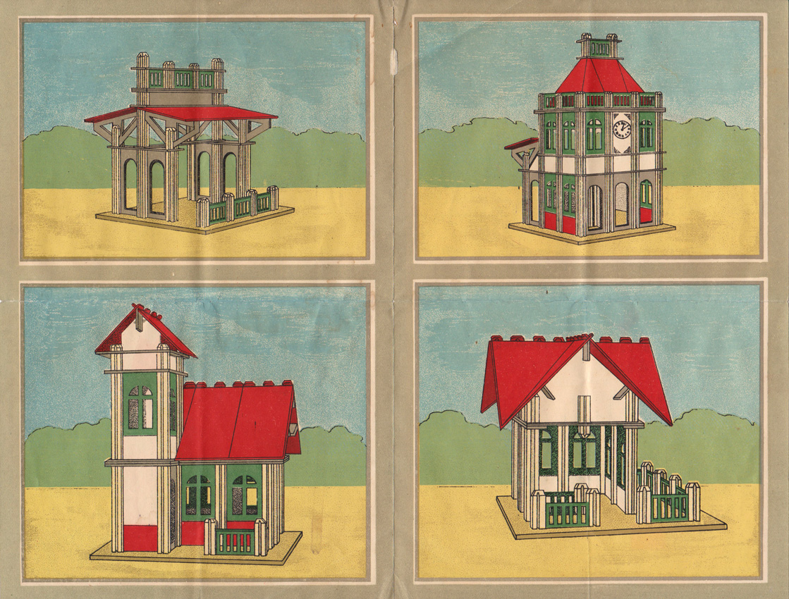
This is the front of Price List Undated #7. Note that the two lower images are taller (more square), and that's how they also appear on the boxes.

Lid. Although the paper looks flat, there is actually a rich texture. Bottom, made with same paper
See below.


Inside lid. Note embossing from logo. Serial number 31615. Round windows. No numbers on these columns. However, Rien ten Bos' set, which has the
image set in a depression, has numbered columns (above), suggesting that when they first
started pasting images, they did so in a depression, and later they just pasted it on the surface.


This Series also comes with the Set 0 "village" manual. Both lid and bottom are reinforced. The bottom is taller than the lid


Texture of the paper, only apparent when light strikes from the right angle. From a distance is just looks slightly opalescent.
Above set courtesy Leen Kalden
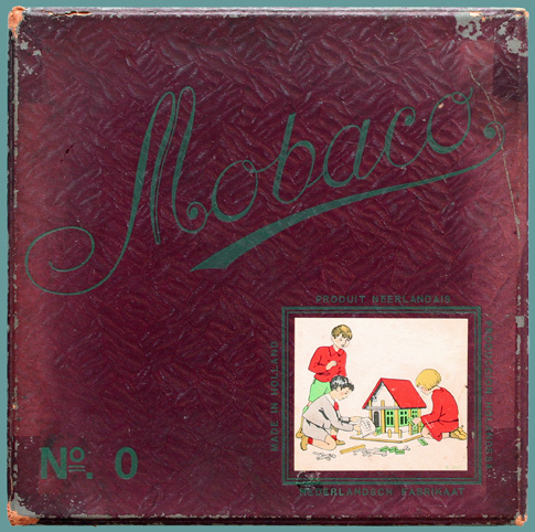
SET 0 - SERIES 6


Lid with new picture in slightly embossed area with black ink Bottom now uses orange paper instead of red-brown. It has a different texture.


This is the last series with a serial number in the lid Round windows


New, cheaper, "Art Deco" manual with craft paper cover. Table of contents with place for Picture on the lid is Design no. 39 of Set 2, but drawn from a
Contents are identical to previous version with the village, date stamp, but none here. Printer different vantage point.
except models printed inside & outside rear cover omitted. code indicates December 1929.
Above set courtesy Leen Kalden
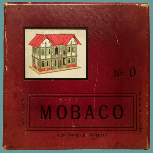
Image courtesy Matthia Keyes Image courtesy Leen Kalden
Comparing these two lids, you can see that the picture and logo are aligned differently. Also, placement of No. 0 is different.
It appears that Moubal used separate stamps for the various items on the lid, and workmen weren't completely consistent with placement.
Although these lids appear to be made with different paper, it is actually the same, but fading and lighting conditions vary.
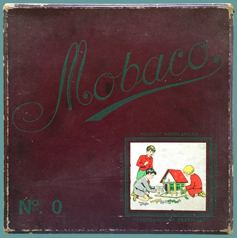
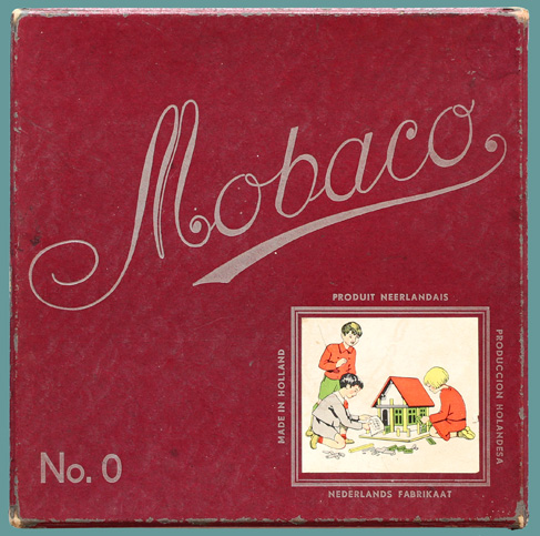
SET 0 - SERIES 7
Series 7 has a new cursive logo on the lid. It's the same on all the sets in this series, except for Set 0, which has an extra curl left of the M

Lid with new paper, new logo, new typeface for No. 0 and for Bottom still has the same orangy paper. Price tag from De Bijenkorf
text around house. House image tightly cropped. for fl. 3.25 indicates it was purchased between 1925 and 1932 or 1933.


Inside of lid now features an illustrated parts list. The window Contents, with square windows.
is shown with round uppers, while this set has square windows.

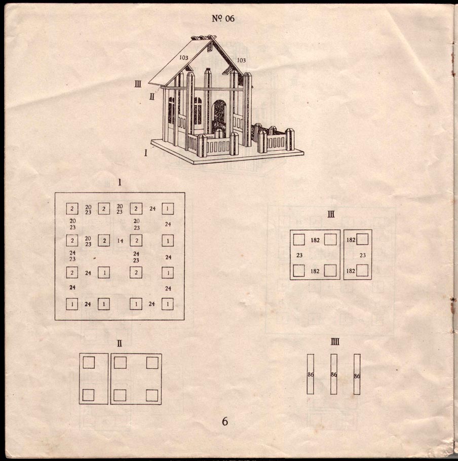
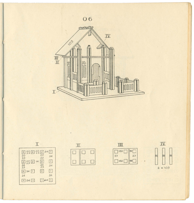
This Series comes with a new manual with Here a page from a previous manual, showing Model No. 06. In the new manual with the colorful gnome on
plans for Sets 00+0+1. In order to fit in the All the lettering is type set. the cover, the perspective is still the same size,
smaller Set 00 box, the manual is smaller but plans are redrawn much smaller, and the
than both previous Set 0 manuals. lettering in the plans is done by hand.


New is also an illustrated table of contents. Columns no longer need to be numbered, Corner reinforcement remains unchanged. Lower box is taller than lid,
as one can reference the drawing. However, numbering of columns already stopped which rests on the lower box.
a few years earlier. In the intervening years, young builders had to rely on the
perspective to figure out which size column to use where.


Paper used on this and following Series has a distinctive embossing, giving it a Further zoomed in, showing fine ridges. The picture on the right is
shiny look. Lettering is printed with silver or gold ink over the red-brown paper. glued onto the lid.
Note the double curl on the left side of the M. Set 0 is the only set to have that, all
other sets in Series 7 have a single curl.
Above set courtesy Leen Kalden
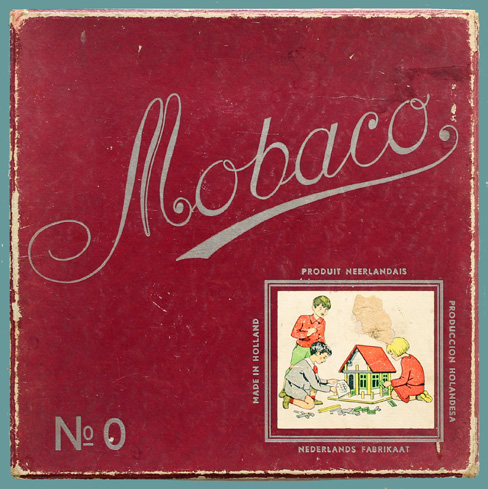
SET 0 - SERIES 9
Same as Series 7, except house has square windows.
Looking for better images of this set!

Set courtesy Marktplaats
SET 0 - SERIES 10
In Series 10, the house illustration is replaced with a drawing of three children playing, by artist Harmsen van Beek.
Set 0 comes in two versions: with a curly M, like Series 7, and without, like the rest of Series 10. I assume that the sets with a curly M are left-overs from Series 7. Once used up, Moubal switches to the same logo as on all other Series 10 boxes.
The logo in Series 10 is slightly different from the logo used in Series 7, 8 and 9. In Series 10, the difference between thin and thick calligraphy is smaller, and the underline is shorter. Also, calligraphy of a and c letters is slightly less elegant.
Below first a "curly" example, like Series 7, then a "normal" Series 10 example.
VERSION 1

Lid is the same as Series 7, except with a different picture Bottom is the same as Series 7.


Table of contents inside lid is now with a square window. Contents also with square windows.


Table of contents now finally with a square window. Detail of sticker with children playing.


The manual now also has square windows. Included for the first time is a loose leaf instruction page. This price tag for fl. 2,70 (from another example
This is odd, because there is a Version 2 The printer code indicates it's from September 1935 in this series) indicates the set was sold in 1934,
example with round windows. You'd expect with a print run of 5000 copies. In the red & black 1935 or 1936.
Moubal to first use up the round windows! version of the manual, this page is part of the booklet.
Above set courtesy Leen Kalden
VERSION 2
Here Set 0 with the "normal" Series 10 logo, without the extra curl:

Lid with new drawing of playing children, by Harmsen van Beek Bottom with new orange-brown paper, with texture like ostrich skin.


Inside lid with table of contents. Contents with square windows.


Table of contents, now with square window. The colorful 00+0+1 gnomes manual is replaced by a cheaper
manual with black + red cover. This manual is for Set 0,
Set 01 and Set 1. A similar manual exists for Set 00.
Some Sets still have the previous colorful gnomes manual, with
either round or square windows.


Picture by Harmsen van Beek. His initials are at the bottom-left. Note how large Detail of "ostrich" paper texture
the house is relative to the children, probably 3x too large!
Above set courtesy Leen Kalden

An example of an earlier set of this series, with the colorful gnomes manual with round windows


Three examples of sets with the a red & black 0+1 manual. The one on the right also shows a price list, which is from 1937, 1938, 1939, 1940, 1941 or 1950
Above 4 sets courtesy of Marktplaats
SET 0 - SERIES 11
Like Series 10 with brown textured paper, but with green printing and new children's drawing, clumsily copied from Harmsen van Beek's illustration.

Lid with green printing. Drawing is copied from Harmsen van Beek Paper on bottom now has a bit of a wood-grain look.
but cropped smaller. Colors gray, pink and tan are no longer a spot
colors, but rasterized. The o in No has a double underline.


Table of contents inside lid (detail below) Contents, with square windows.


Table of contents has a green printer code: K2384 Detail of paper texture

Redrawn version of children's illustration. The initials HvB are gone. Now only 3 spot colors: green, red and yellow. Pink, gray and brown are made using a half tone
grid (raster). There is a printer code: K2607.
For comparison, here the two drawings side-by-side, at the same scale:
Series 10 Series 11
Above set courtesy Leen Kalden
SET 0 - SERIES 12
Like Series 11, but with cheaper lid paper, without the fancy embossing.
This sample courtsey of Jerry Vanclay. Illustration has a printer
code, same as Series 11.


This sample courtsey of Johan Jager. Illustration has a printer Back has wood look. Sticker states that price is determined using government
code, same as Series 11. pricing guidelines, per rules dated 27 May 1947. Fl. 5.95 indicates this set was sold
before 1949 (when the price was fl. 8,35), so it's either from 1947 or 1948.
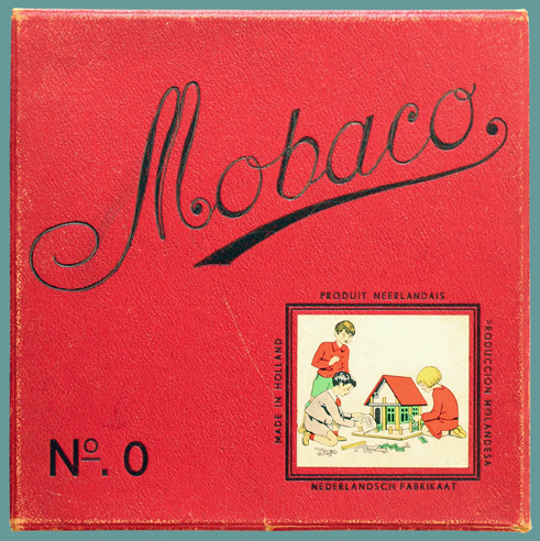
SET 0 - SERIES 13
Similar to Series 12, with lightly textured paper, but with silver cursive logo and no printer code on the illustration. I have two examples, the main difference being the typography of No. 0 and the paper on the back of the box.
The words NEDERLANDS FABRIKAAT (finally) use the new spelling.
Version 2 is probably the last series sold by Moubal.
VERSION 1

Lid Bottom with wood-like paper.


Inside lid Contents with square windows


Detail of paper texture. Note the typography of the set number. Left, for the set above. Right for Version 2 below.
In Series 7, 10, 11 and 12, the o in No has a double underline. In the set above, it's a single underline. In the set below, there is no underline.
Above set courtesy Leen Kalden

Example from Marktplaats
VERSION 2
Differences with Version 1 are the typography of "No. 0" and the paper on the back of the box.

Lid Bottom has a printed red grid. The lines a slightly wavy.


Inside lid Detail shows waviness of lines. Price of fl. 10.75 is for 1951.


Table of contents without printer code Corner reinforcement still the same

Detail shows paper texture, similar to paper used in Series 4 and 6. Printing of illustration is similar to Series 11, except no printer code and red half-tone has edge
artifacts. See comparison below:

Series 11 (with printer code) Series 13 (without printer code)
Above set courtesy Leen Kalden

Here an example from Marktplaats, with a red and black manual.
SET 0 - SERIES 15
Unusual set, so far only seen as Set 0. The construction of the box is different, with the corners stapled using flat copper staples. Paper has leather texture.
NEDERLANDSCH FABRIKAAT is old spelling, which officially ended in 1936, while this set was sold in 1947 or 1948! It resembles most Series 11 and 12: same logo, same illustration with printer code, same old spelling of Nederlandsch Fabrikaat. Only difference is the material, color and construction of the lid. The orange paper on the bottom resembles Version 1 of Series 13. Perhaps it should be considered a special version of Series 12?

Lid with black printing, embossed into cardboard Back of box, orange paper with wood-like impression.


Inside lid. Notice construction of corners. Thin cardboard. Bottom has no corner reinforcement clips. Square windows.

Detail shows paper texture. Paste-on illustration has printer code K 2607, same as the printer code in Series 11 and 12.
Nederlansch is still using old spelling, even though this set was sold after the war. Series 11 and 12 also used old spelling, so possibly this set is a "special" version of
Series 11 or 12.


Flat copper staple used at corners. Corner flap and flat copper staple. Printing is embossed into cardboard. Detail shows that
underline under the o is actually double.


Like in Series 12, sticker states that price is determined using Set found on Marktplaats shows that it comes the with red and black version of the
government pricing guidelines, per rules dated 27 May 1947. manual.
Fl. 5.95 indicates this set was sold before 1949 (when the price was
fl. 8.35), so it's either from 1947 or 1948.
Above set courtesy Leen Kalden